Tutto Napule
A Naples deli, shipped UK-wide
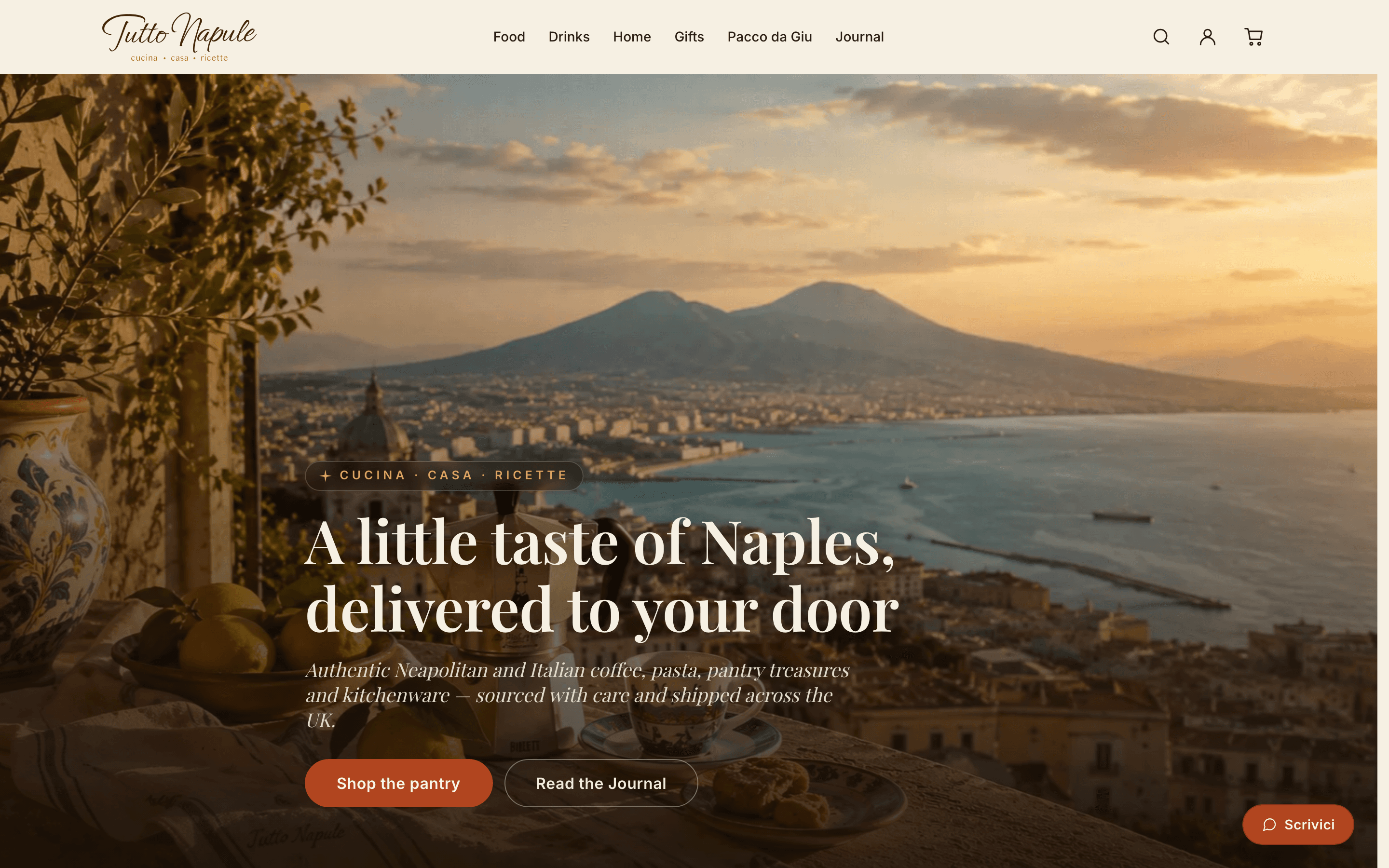
Tutto Napule is a headless Shopify storefront selling authentic Neapolitan and Italian food, coffee and kitchenware into the UK. It is a complete commerce build rather than a catalogue: collections and product pages with variants and recommendations, a cart that keeps the Storefront token on the server, a signed-in account area running on Shopify's Customer Account API with no database behind it, a Shopify-authored journal of recipes, a contact and support desk on Resend, and a full SEO and structured-data layer. The identity is a premium Neapolitan gastronomia: warm ivory paper, espresso-brown ink, terracotta and ochre, with an Ephesis script wordmark reserved for the brand mark alone.
The shop serves two audiences at once, and the whole design answers to both. UK professionals want quality they cannot find in a supermarket, so the site reads like a curated deli: editorial, uncluttered, generous with white space. Italians living in the UK want a taste of home, so the authenticity signals are real ones: the dialect in the name (Napule, not Napoli), Italian labels over English copy, and a Pacco da Giù range named after the parcel families in the south have posted north for generations. No flags, no chianti-bottle clichés. The reference was a high-end Naples deli, not a tourist trattoria.
Stack & architecture
I built the storefront end to end: Next.js 15 against the Shopify Storefront API over native fetch, SSG with a two-tier revalidation policy documented as a single source of truth, and a cart that lives in React Context but mutates through a server route, so the Storefront token never reaches the browser. Navigation and homepage categories are driven by env vars, so a new category ships without a code change.
Visual design
I set the premium gastronomia identity: warm ivory ground instead of white, espresso brown instead of black, terracotta for action and ochre for ornament, with Bay-of-Naples sea blue as the cool secondary. Playfair Display carries the headings, Inter the body, and the Ephesis script is held back for the wordmark alone. The logo set is bespoke: typemark, Vesuvius emblem, a quatrefoil separator that became the site's horizontal rule, and an ivory-inked lockup for dark surfaces.
Polish & finish
The finish is in the restraint. Blocks drift in once as they arrive through a single Reveal primitive that renders as whatever tag you give it, so grids keep their layout and hover states still work. Above-the-fold sections are measured against a live header-height variable so the hero and the category bento fit one screen. Text over photography always sits on a scrim or a glass chip, focus rings are sea blue on :focus-visible, and reduced-motion zeroes durations and delays globally.
Full headless commerce
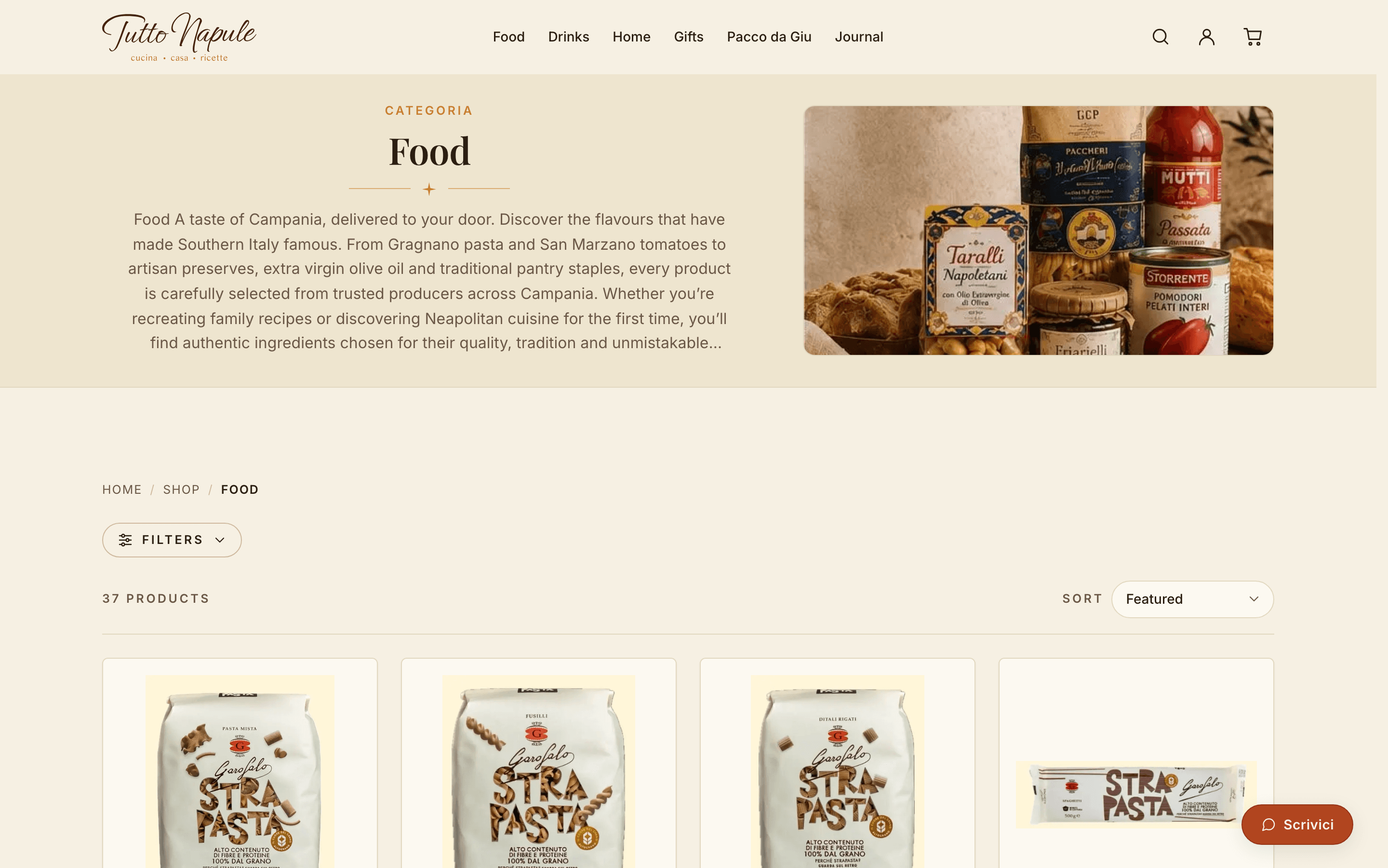
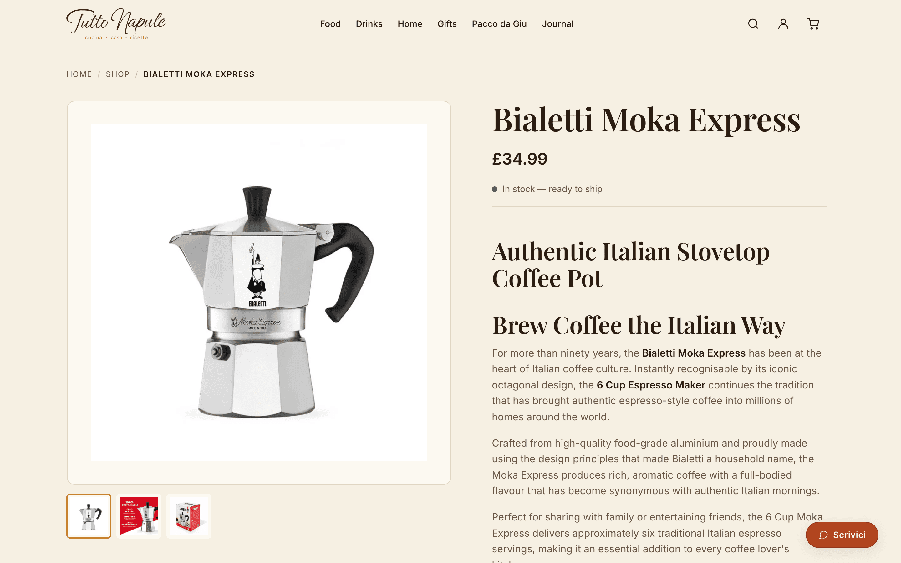
Collections, product pages with variants, galleries and recommendations, live search, a slide-in basket and checkout handed to Shopify. Product copy, categories and the journal are all authored in Shopify Admin and appear within a minute.
Accounts with no database
Signed-in customers get orders, order detail, profile and a support desk on Shopify's Customer Account API. Login is Shopify-hosted and passwordless, and the session is AES-256-GCM sealed into an httpOnly cookie, so the app stores no customer data at all.
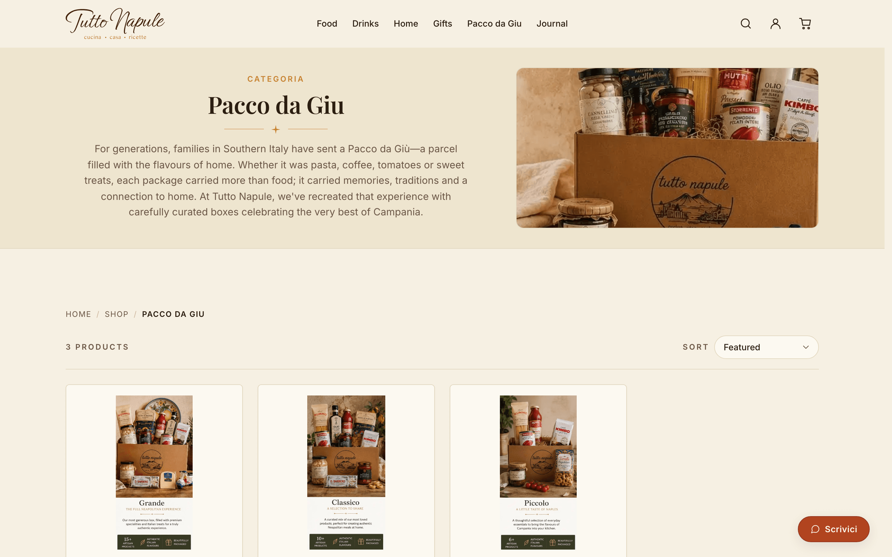
Pacco da Giù
The signature range is a tradition rather than a gift box: the parcel Southern Italian families have posted north for generations, in three sizes. It carries its own collection story and reads as the reason to buy, not an upsell.
Config-driven categories
The top nav, the mobile drawer and the footer all read one env var, so adding or descoping a category updates every surface at once. Each nav link opens a hover preview panel with a cover image and a line of description, built in pure CSS.
The tradition, as the signature range
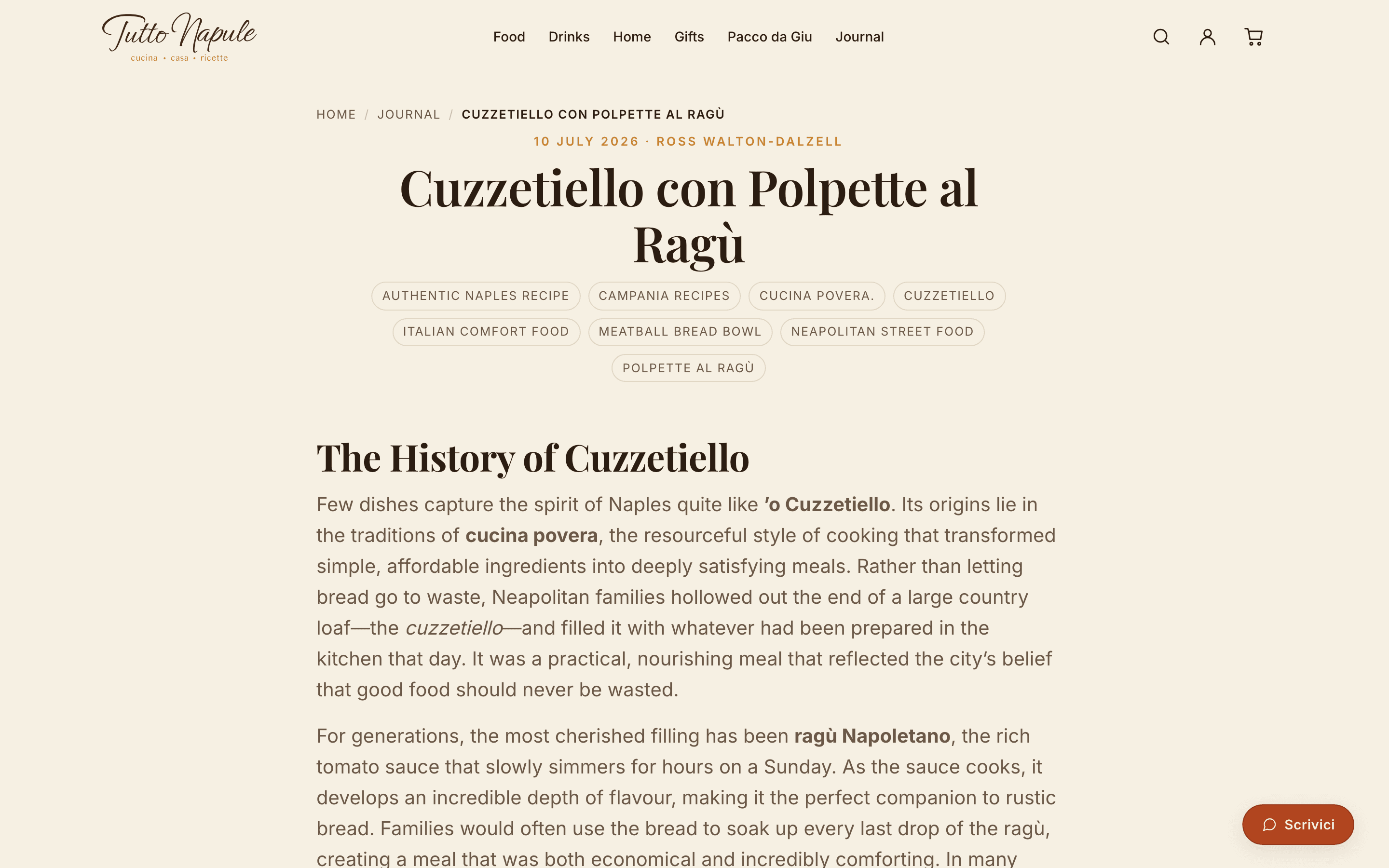
In the shop
In the journal
Palette
Typography
Playfair Display carries every heading; Inter handles body, navigation and interface. Ephesis, the brand script, is reserved for the wordmark and never appears in a heading, a button or body copy, which is exactly what keeps it feeling like a hand-painted sign rather than a font.
Signature details
- The quatrefoil separator lifted from the logo replaces every plain horizontal rule on the site.
- Ivory, not white: the ground is warm paper, and the deeper ivory band is what separates one section from the next.
- Terracotta is action and ochre is ornament. If a section feels loud, the terracotta comes out first.
- Italian belongs in the labels, English in the sentences: Cucina · Casa · Ricette, Il nostro negozio, Scrivici.
- The Storefront token is deliberately not NEXT_PUBLIC_: cart mutations run through an /api/cart route, so the token stays on the server while the cart still feels instant.
- Two-tier caching, time-based ISR or never-cached, with each route segment's revalidate matched to the data it fetches and the whole policy kept in one table alongside the constants it documents.
- Customer Account API endpoints are discovered at runtime from the shop's .well-known documents and cached for an hour, so there is no hardcoded API version to drift.
- An /account URL is never passed to next/link: Next would prefetch it, and prefetching logout signs a visitor out just by scrolling it into view.
- Every service degrades to a friendly notice rather than a crash. The site builds and renders before Shopify, Resend or the account channel is connected.
- Central SEO helpers emit canonicals plus Product, CollectionPage, BlogPosting, WebPage, Organization and WebSite schema; sort and cursor variants collapse to one canonical URL, and the personal account area is deliberately kept out of the sitemap.
Like what you see?
I’m available for freelance work. Let’s build something together.